idemama.com

Step 1
Before we get started in Illustrator, download the Museo Font, and install it on your system.

Step 2
Create a new Letter sized document, then use the Rectangle Tool (M) to create a rectangle that is the size of your document.

Step 3
Fill the rectangle with a Radial Gradient from the Gradient Panel. Change the first swatch on the Gradient slider to a violet color and change the second swatch to a dark violet color.

Step 4
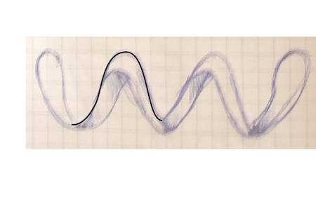
With the Line Tool (\), draw a line at a 45 degree angle that stretches from the bottom left corner to the top right side. Change the stroke to 5 pt and change the color to white (so you can see it against the background, but we will be changing it soon).

Step 5
Select the line with the Selection Tool (V) while holding down Alt, and drag out a copy to the right and down so the copied line is still inside the background.

Step 6
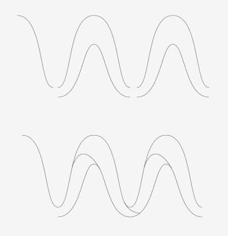
Select both lines and and create a blend by going to Object > Blend > Make. Next, go to Object > Blend > Blend Options, to bring up the Blend Options dialog. Change the Spacing to Specified Steps from the drop-down menu and change the option to 15.

Step 7
With the blend selected, go to Object > Expand to separate the blend. With the lines still selected, expand again, to outline the stokes.

Step 8
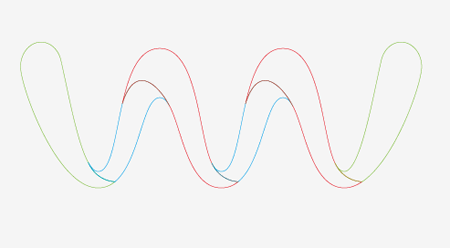
Fill the outlined line with the same Radial Gradient that you used for the background, but change the first swatch to a lighter violet than before.

Step 9
Select the lines and the background, then use the Gradient Tool (G) to adjust the gradient. Click in the middle of the rectangle and drag to the top of the rectangle. This will match up the transitions on the gradients

Step 10
Create a ellipse with the Ellipse Tool (L) that is 10 px by 10 px. Fill it will a violet color.

Step 11
With the ellipse selected, go to Object > Path > Offset, to bring up the Offset Path dialog. In the dialog, change the Offset to -4 px. Change the offset ellipse to a light orange.

Step 12
Select the bigger ellipse and change the opacity to 0 from the Transparency Panel. Select both ellipses and create a blend by going to Object > Blend > Make.

Step 13
Before you start making a brush in this step, save a copy of the blend for later use. Select the new blend and drag it into the Brush Panel. When the New Brush dialog opens, select New Scatter Brush from the dialog. When the Scatter Brush Options dialog opens you are going to need to change a couple of settings.
First change all the drop-down menus to Random except the Rotation. Change the first field for the Size to 20 and the second field to 100. For the Spacing, change the first to 15 and the second to 115. For the Scatter, change the first to -220 and the second to 175.

Step 14
With the Brush Tool (B), draw a wavy brush stroke in the middle of your background, creating a scatter of your blend.

Step 15
With the brush stroke selected, change the Blend Mode to Overlay from the Transparency Panel and give it an Opacity of 25.

Step 16
Draw four to five more brush strokes, then change all of them to Overlay. Change the opacity on the stroke, but vary the percentage as well as the stroke weights.

Step 17
Select the blend copy that you saved from Step 13 and scale it to 52 px by 52 px.

Step 18
Set the copied shape to Overlay and it place over your brush strokes.

Step 19
Copy (Command + C) the blend ellipse and Paste (Command + V) a couple more times. Scale the copies separately to get varying sizes, then place them in different spots over the brush strokes.

Step 20
That should do it for the background. Now let’s take a look at the text. Type out some copy and change the font to the Museo font you downloaded. Change the Tracking to -100 from the Character Panel. Outline the text by going to Type > Create Outlines.

Step 21
With the outlines selected go Object > Ungroup (Command + Shift + G).

Step 22
In this step we’re going to modify the text. If you typed something different, the basic idea of connecting the letters will be the same. With the Direct Selection Tool (A), press Shift and select the top right line on the V. Drag the line until it’s overlapping the E. You might need to modify individual anchor point as well. In the example below, I dragged the top right anchor point to the right to close up the gap.

Step 23
Continue doing this to the other horizontal elements of the outline text until all the text is connected.

Step 24
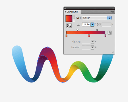
Fill the text with a Linear Gradient. Add another swatch to the Linear Gradient by clicking right below the Gradient Slider in the Gradient Panel to give you a three swatch gradient. Change the first swatch to white, the second swatch to a light blue-green color, and the last swatch to a dark blue-green color. Use the Gradient Tool to adjust the gradient so the white color is on top.

Step 25
Place the text in the middle of your document over all the other artwork.

Step 26
For this next step, we’re going to create another brush. Draw a 14 px by 14px ellipse. With the Direct Selection Tool, select the right anchor point and drag it to the right – doubling its length. With the point still selected, set the Control Panel defaults to the Anchor Options. To the left of the Control Panel, press the Corner button, converting the anchor point to a corner.

Step 27
Fill the shape with black, drag the shape into the Brush Panel, and Choose New Art Brush from the New Brush dialog. When the Art Brush dialog appears, change the Colorization Method to Tints at the bottom of the dialog.

Step 28
For this step I’m going to use the Brush Tool (B). If you’re not comfortable with the Brush Tool (B) for making paths ,then you can use the Pen Tool (P) and apply the brush to the stroke. Create a brush stroke to the bottom left of the V. It is a good idea to change the stroke color to a lighter color than black so you can see it.

Step 29
Drawn another brush stroke above the previous one.

Step 30
Expand the brush strokes by going to Object > Expand Appearance. Next, it’s a good idea to clean up the leftover paths by going to Object > Path > Clean Up.

Step 31
Fill the outlined brush stroke with a Linear Gradient. Make the first swatch a blue and the second swatch a dark blue. Select the text and bring it to the front by going to Object > Arrange > Bring to Front.

Step 32
Copy (Command + C) and Paste (Command + V) both shapes numerous times around the text. On some of the copies, change the swatches on the Linear Gradient to a pink color and a dark pink color. Adjust the gradient so the darkest part of the gradient is closet to the text. When you place the copies around the text make sure to rotate and flip the shapes. All done!

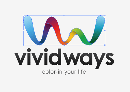
Final Image
Below is the final type treatment image again.